In calligraphy, the nib is one of the most important tools. It directly affects the line that appears on paper, how the ink flows, and the overall feeling of writing. Different nibs are designed for different styles, line widths and working methods, and there is rarely a single nib that suits everything.
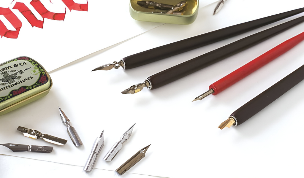
For beginners, the world of nibs may seem confusing at first, but understanding the overall picture is enough to get started. Each nib serves a specific purpose. Choosing the right nib helps achieve the desired line and supports the movement of the hand rather than working against it. The examples below come from the Manuscript nib range and help illustrate the differences between types.
Main Groups of Nibs
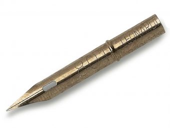
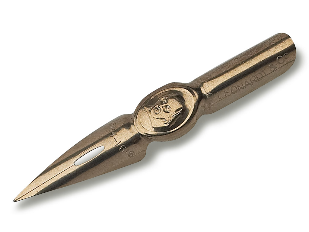
In general, calligraphy nibs can be divided into three main groups: fine and flexible nibs, nibs for drawing and detailed work, and general-purpose writing nibs. In addition, there are more specialised nibs designed for specific line shapes or visual effects.
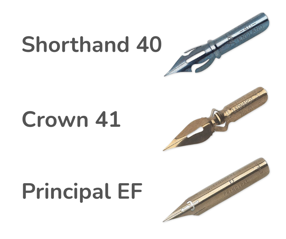
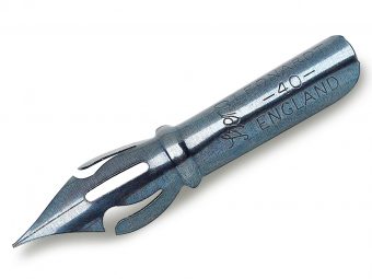
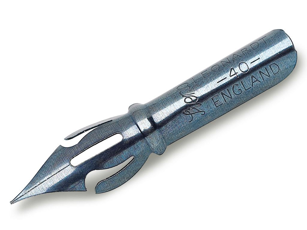
- Shorthand 40 is a very flexible, sharp-pointed nib that enables fine lines and smooth transitions between thin and thick strokes.
- Crown 41 is a fine nib with medium flexibility, well suited for small to medium-sized lettering.
- Principal EF is an extra fine and highly flexible nib that responds sensitively to pressure and is ideal for detailed and expressive writing.
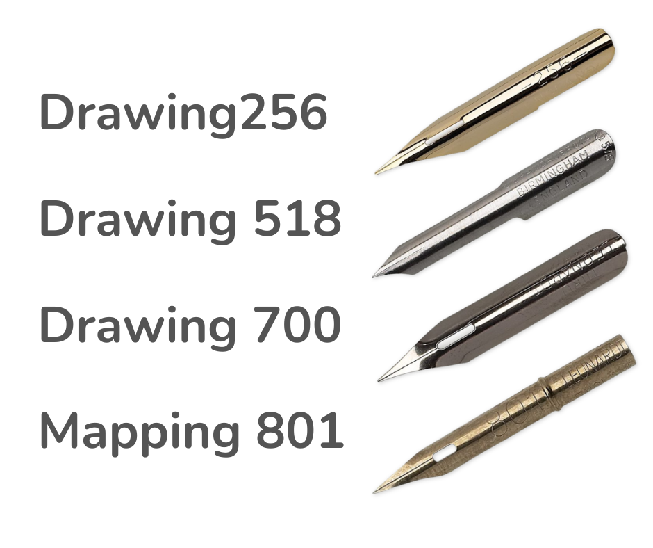
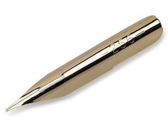
- Drawing 256 is a fine nib with medium flexibility, suitable for capitals as well as decorative lines.
- Drawing 518 is an extremely fine and flexible nib that allows for very precise line work.
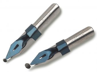
- Drawing 700 is a fine nib that works well for sketching and freer ink drawing.
- Mapping 801 is a fine-pointed nib designed for detailed work and delicate embellishments.
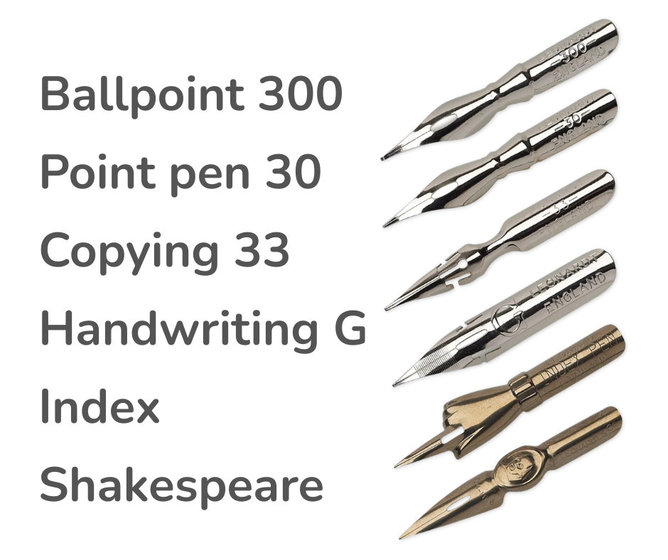
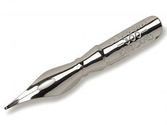
- Ballpoint 300 produces a softer line and is well suited for smooth and comfortable writing.
- Point Pen 30 is a classic long, fine-pointed nib for delicate and precise lines.
- Copying 33 is a more flexible nib suitable for both writing and drawing, offering a more expressive result.
- Handwriting G is an extra fine general-purpose nib with good ink flow, making it suitable for practice.
- Index creates a more uniform line and is suitable for decorative and clear writing.
- Shakespeare is a fine-pointed decorative nib suitable for both writing and as a collector’s item.
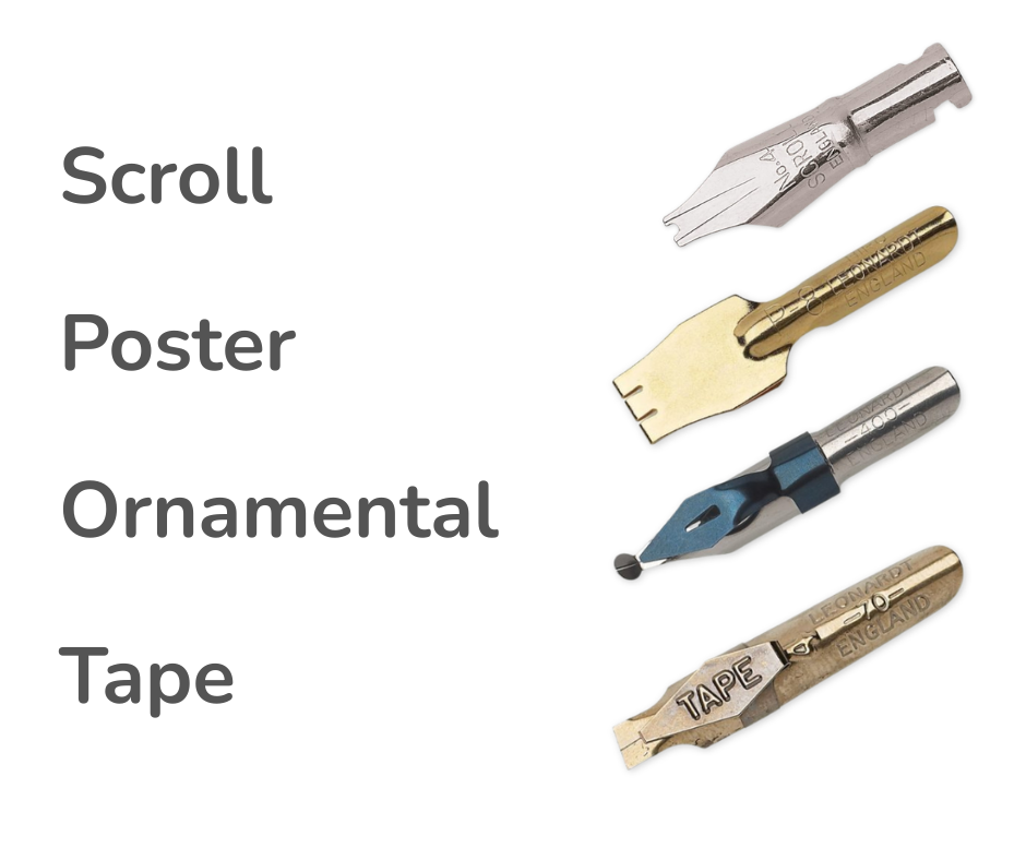
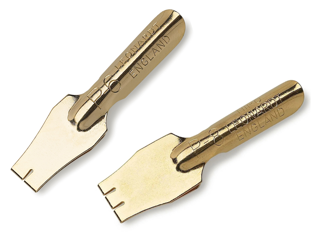
- Scroll – Allows two perfectly parallel lines to be drawn at once. It is mainly used for decorative borders, certificates, posters and illustrations where a symmetrical and striking effect is desired.
- Poster – Creates a broad and strong line. It is ideal for large-scale lettering, headings and posters where visual impact and readability are important.
- Ornamental – Designed for creating a consistent line width. A built-in ink reservoir ensures a steady flow, making it suitable for stencil work, ornamentation and repetitive strokes.
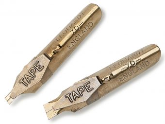
- Tape – A slanted broad nib that is particularly well suited for classical scripts such as Gothic, italic and Carolingian minuscule. The ink reservoir allows for long continuous strokes, which is useful for both lettering and ornamentation. As these nibs are angled to the right, they are primarily suited for right-handed users.
How to Choose the Right Nib
When choosing a nib, it is important to consider the desired script style, writing position and personal preference. A favourite nib often develops through experimentation, and different nibs may serve different roles within the same artist’s toolkit.
The beauty of calligraphy lies in the fact that each nib speaks a slightly different language. Finding the right nib helps you understand that language more clearly.


